Logo Design Projects
Written By: Carisa Peters
When we are tasked with any design project, whether it’s for print or web use, the word “logo” is always part of the conversation. Promoting an organization, even if it’s not the main focus of the design, should include the logo or branding of that organization for quick recognition. We have had the opportunity to design and refresh many logos for different businesses and have featured several below.
TeleTwist

Charlie Driver Products, LLC – TeleTwist Anchor
The TeleTwist Anchor was a new product that needed a logo to use primarily on product packaging. Because it was something that people had never seen before, we wanted its use to be evident when consumers saw the logo. The target audience was boat owners, and our goal was to connect with them right away with this branding.
Clark Early Learning Center

Springfield City Schools – Clark Early Learning Center “Little Cats” Mascot
Holmes had created mascots for the Springfield City School District elementary and middle schools in the past, so we were excited when the opportunity arose for us to create a “Little Cat” for the new Clark Early Learning Center. This mascot needed to be more closely related to that of Springfield High School, illustrated as more of a character than an icon, but we did include the four stars used in the other school branding as part of “Little Cat’s” backpack.
DC Door Company
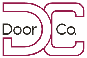
DC Door Company
When we were tasked to redesign the logo for DC Door Company, we wanted to condense their name into a really recognizable and usable format. The D and the C in their name are both wide, rounded letters. We chose to make a statement with them and abbreviate the Door Company part of their name inside the letters. This technique can be difficult to achieve and still maintain readability, but we feel it was successful with this branding.
FLEX
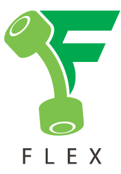
FLEX Training with Alexis Fourman
The goal with the FLEX logo was to have branding that worked even without words. This logo was going be used in many applications and needed to reflect what FLEX was without the name. The client chose the color scheme, and we used the darker color to draw attention to the F which supports the name of the business.
Greater Ohio Eye Surgeons
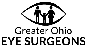
Greater Ohio Eye Surgeons
The Greater Ohio Eye Surgeons had gone through a rebrand that they felt took them too far from their original, well-known logo. We created a clean, modernized version of their original logo. It features the family within the eye shape. The focus is on “eye surgeons” in their name to further promote what they do. We felt that this brand would be quickly recognized by past and existing patients, and would also connect with new patients seeking out their services.